
The coronavirus pandemic has created a “real appetite” for visual storytelling using data, as demonstrated by record-breaking stories at the likes of the Financial Times, Times, and Washington Post.
The FT’s coronavirus tracker page, which charts the daily numbers of deaths resulting from Covid-19 in various countries, has become the news website’s most viewed article of all time.
The page showcases up to ten charts in total, with a small team reviewing it as the pandemic continues. They don’t want too many graphics at once to stop it becoming just a “data dump”.
Senior data visualisation journalist at the FT John Burn-Murdoch told Press Gazette his first Covid-19 graph was meant to be a one-off for a reporter who asked if he had any statistics showing how the UK and Spain looked in comparison to Italy, where deaths by the virus overtook China last month.
But the strength of reaction to the chart and its later evolutions, both at the FT directly and on social media, “seemed to suggest that this was a format that really seemed to resonate with people”, he said.
NEW: Wed 8 April update of coronavirus trajectories
NB: we’ve reverted to the 7-day moving average
Daily new deaths:
• General trend in US and UK is still more deaths every day than the last
• Japan joins this chart, deaths tracking ItalyLive charts: https://t.co/JxVd2cG7KI pic.twitter.com/fFoOudxcoT
— John Burn-Murdoch (@jburnmurdoch) April 8, 2020
“People want to be able to know where they are in the global context.
“Everyone reads and hears and watches the news every day and hears about how bad things are or how maybe things are getting a little bit better. But all of these verbal descriptions can feel a little bit hard to grasp sometimes, or at least hard to work out.
“Such and such a number of deaths – is that horrifically bad? Is it slightly bad? Is it actually maybe good? And I think without that additional context it can be probably a bit more stressful than it would otherwise be, and just difficult for people to know what they’re hearing.”
The FT made the tracker page – and some other parts of its coronavirus coverage – free to read, putting it outside its paywall, after it became clear readers were consuming it as a piece of public service journalism.
“People were clearly seeing this as a very useful bit of information and data that was informing people and was helping lead to more intelligent discussions about what needed to be done,” Burn-Murdoch said.
“And so I think there was a feeling that in a public health crisis like this, this information should really be available to all.
“We were getting huge international calls for this and obviously a lot of people who maybe don’t necessarily have the means to pay for the FT were wanting to access this information.”
He added that it had also proved an opportunity for the FT to reach a wider audience and show that it is covering the crisis as a public health story, as well as its impact on businesses.
“Any chance we get to let people in over the wall, as it were, and say the FT does brilliant finance and business news but we also do fundamental just news stories, we do health stories, we do politics, we do all of this stuff – it’s never a bad thing for us to let people see that.
“And through my own emails I’ve had people say that they’ve subscribed to the FT as a result of these visualisations, so even as a sort of business decision, I think it was pretty smart one.”
‘Boon’ for Times data and digital storytelling team
At the Times, the coronavirus story that has seen the most engagement and page views is its own tracker page, updated daily with graphics including the confirmed number and location of cases in the UK and the worst hit areas.
But the News UK title has not followed the FT in making this page free to non-subscribers. Sam Joiner, head of data and digital storytelling at the Times, told Press Gazette engagement was the newsroom’s priority.
“That’s the metric we focus on, because it’s the one that we can control,” he said.
“When we get readers in, the more time they spend with us on an article, the higher their engagement score.
“And we’ve got enough data now to show that when we do build these interactive or visual elements, the engagement goes up.”
Joiner added: “We have a brilliant marketing team and a SEO and social team who push our content to new readers, but fundamentally we’re focused on what we can do with the subscribers we already have and trying to keep them happy.”
As of the end of June last year, the Times and Sunday Times had more than 304,000 paying digital-only subscribers and 539,000 across print and digital.
Two charts on the Times coronavirus tracker page (screenshot from 8 April):
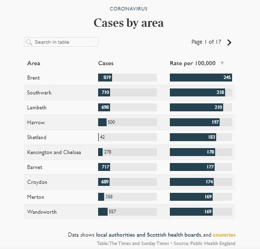

Joiner said the popularity of content like the UK case tracker showed “real appetite for this sort of visual storytelling”, especially as coronavirus is driven by “human interest, and the victims and the families and the nations that are involved, but also the numbers”.
“Explaining complex ideas visually can make things easier for readers to understand,” he said.
“And with something like coronavirus the story goes from nought to 100 so quickly. No-one had heard of it three months ago and now everybody’s an expert in social distancing.
“From case curves, log scales and the makeup of a virus to how you can safely wash your hands – there is a huge amount to take in and visuals can play a big part in helping with that.”
The coronavirus crisis hit the UK around the time the Times merged its data and interactive teams into one, drawing their skills together and creating an easier point of contact for the rest of the newsroom.
And although coronavirus is posing an existential threat for many news publishers, it has proved a “real boon” for those in the “dataviz” community, Joiner said, because of the opportunities available for telling the story.
‘Simulitis’ at the Washington Post
At the Washington Post in the US, an article using graphics of bouncing balls to show how social distancing can slow the spread of Covid-19 has become its most-read online story ever.
The Post has published the piece in 18 languages and put it outside its online paywall, helping to boost its readership and spread the research.
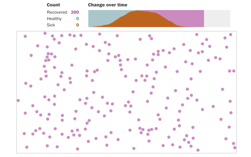
One of the graphics in the Washington Post’s Simulitis story.
Post managing editor Emilio Garcia-Ruiz told Press Gazette: “The piece clearly resonated with tens of millions of people. It made a very complex concept very easy to understand.”
Headlined: “Why outbreaks like coronavirus spread exponentially, and how to ‘flatten the curve’,” the story was written by graphics reporter Harry Stevens who had the idea of demonstrating how virus transmission occurs using a made-up disease called “simulitis”.
Explaining how the piece came about, Garcia-Ruiz said Stevens had been experimenting with bouncing circle graphics and “proposed the idea of using [it] to demonstrate how a disease could spread through a network”.
“The editors thought it could work, so Harry conferred with graphics director Chiqui Esteban and figured out how to do it,” said Garcia-Ruiz.
It took two weeks and several editing sessions, as the graphic was refined while the story kept changing, before it was published in its final form.
“We were delighted that our graphic helped people understand the importance of social distancing,” added Garcia-Ruiz.
Lessons from the data frontline
Asked for his learnings from the crisis so far, Burn-Murdoch joked: “Work-life balance,” adding: “The related, but more serious answer, is just handling the volume of feedback.”
Such was the strength of feeling about the FT’s charts, Burn-Murdoch began receiving hundreds of messages per day after he asked for feedback.
He has now set up a specific email address shared with two other journalists to share the load and ensure any useful tips can be taken on board.
For his part, Joiner warned that newsrooms need to make use of specialists and take care with their graphics as there is a “real importance and responsibility” with this story.
“The visuals you create have a real impact, a life of their own, can be shared really widely,” he said. “So you have to get things right. And rushing to do things quickly doesn’t mean that you’ve done them in the right way.”
He said this means it is “massively important” to ensure newsrooms have people with the necessary skills, including cartographers, designers, data journalists and visualisation specialists.
“Without that you can’t tell these stories in the way that your readers need.”
Picture: FT
Email pged@pressgazette.co.uk to point out mistakes, provide story tips or send in a letter for publication on our "Letters Page" blog