


The Huffington Post has officially adopted its popular nickname by rebranding as “HuffPost” alongside its first ever website redesign.
The new moniker marks the first significant change in branding for the mainly US-based news website in its 12-year history.
The move comes less than a year after co-founder Ariana Huffington announced she was stepping down as editor-in-chief, having been with the newsbrand since its creation in 2005.
New editor-in-chief Lydia Polgreen said of the rebrand: “The new design reflects our bold promise to help readers know what’s real and what really matters.”
Related


The new HuffPost logo is live across all 17 of its online international editions, including the UK, and their respective social media profiles.
The full website redesign is already live in the US and UK and will roll out for each edition later this year.
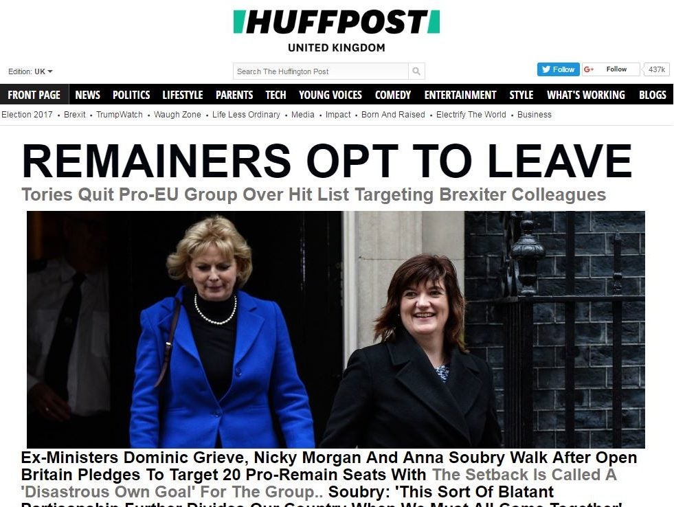
Elements include a new homepage layout including a “splash” image that “tells and shows the most important story of the day” and a “prominent” video player “highlighting original news-driven video”.
Content from our partners


Chief executive Jared Grusd said: “HuffPost is the pioneer of online journalism and continues to lead the digital news landscape. Our changes today build upon our heritage of continuous innovation.
“Today, we make a decided leap into our future. The rebrand and relaunch of our products symbolise our commitment to continually evolve to help our audiences connect with a world that is changing rapidly around them.”
HuffPost has nearly 200m daily monthly visitors across all of its news sites, according to ComScore figures for October 2016. In 2012 it won a Pulitzer Prize for national reporting in the US.
The new logo has been designed by head of product Julia Beizer. She said of creating the design: “We started with what we believe sets us apart – our editorial voice: down to earth, cutting through what doesn’t matter and getting to what’s real.
“These thoughts inspired the forward-slash shape that brackets our name on the top of our site and stands alone as our app and social logo.
“The shape symbolises the company’s movement forward into the future, and subtly pays homage to our heritage as the first scaled digital-only news brand by evoking the forward slash found in URLs.”
Email pged@pressgazette.co.uk to point out mistakes, provide story tips or send in a letter for publication on our "Letters Page" blog